The Bivariate Linear Model
This lab scripts introduces students to the basic linear model in its bivariate form. Rather than use real-world data, we’ll be using fake data we can create. Let this underscore that much of what we know about the linear model and what it tells us comes from simulation. Here, we can play God. We are not afforded that luxury in the real world, but the tools we use come from situations where we can cosplay as the Almighty with respect to a population we created.
R Packages/Data for This Session
You should’ve already installed the R packages for this lab session.
{tidyverse} will be for all things workflow and that’s all we’ll be
using today.
library(tidyverse)
#> ── Attaching core tidyverse packages ──────────────────────── tidyverse 2.0.0 ──
#> ✔ dplyr     1.1.2     ✔ readr     2.1.4
#> ✔ forcats   1.0.0     ✔ stringr   1.5.0
#> ✔ ggplot2   3.5.1     ✔ tibble    3.2.1
#> ✔ lubridate 1.9.2     ✔ tidyr     1.3.0
#> ✔ purrr     1.0.2
#> ── Conflicts ────────────────────────────────────────── tidyverse_conflicts() ──
#> ✖ dplyr::filter() masks stats::filter()
#> ✖ dplyr::lag()    masks stats::lag()
#> ℹ Use the conflicted package (<http://conflicted.r-lib.org/>) to force all conflicts to become errors
For those of you wanting the packages we’ll be using today without loading all of the {tidyverse}, run this. I won’t, but here are the component packages.
# library(dplyr)    # the workhorse
# library(magrittr) # for the pipe
# library(tibble)   # for tibbles
# library(ggplot2)  # for plots
We’ll run one other command, because you may know how I feel by now
about {ggplot2}’s default theme. I have {stevethemes} and I’d really
like to use it here, but we want to stay strictly within {tidyverse}
today. So, we’ll do this.
theme_set(theme_minimal())
Cool beans. Let’s get going.
Creating Fake Data to Learn About the Linear Model
The lecture uses actual (toy) data from the World Bank to introduce you
to the linear model in the bivariate case. Now, I think it might be time
for you to get it in the completely “fabricated” sense. In this lab
script, you are going to create data that you will use to learn more
about what the linear model with its OLS estimator is telling you (by
way of lm() output).
Take careful inventory of what’s going to happen here. We’re going to
set a reproducible seed, and then we’re going to create two new “random”
variables, called x and e from a normal distribution.
set.seed(8675309) # Jenny, I got your number...
tibble(x = rnorm(100),
       e = rnorm(100)) -> Fake

Fake
#> # A tibble: 100 × 2
#>          x       e
#>      <dbl>   <dbl>
#>  1 -0.997   0.745
#>  2  0.722  -1.35
#>  3 -0.617   0.330
#>  4  2.03   -0.0127
#>  5  1.07   -0.464
#>  6  0.987   0.205
#>  7  0.0275  0.464
#>  8  0.673  -0.757
#>  9  0.572  -1.07
#> 10  0.904  -0.263
#> # ℹ 90 more rows
x is going to be our independent variable, which is exogenously
created prior to an observed outcome. e is going to be our error term,
which includes everything not included in the linear model. The presence
of an error term is an important assumption in OLS, and notice here that
the error term is created independently from the x variable. Yes,
they’re in the same data set, and yes they were created by the same
command. However, the generation of x and e are simultaneously
created, but completely independent from each other. If they were
correlated with each other, that would violate a major assumption about
endogeneity in the linear model (that we’ll belabor in another lab
script).
You can test that we successfully pulled this off with a correlation test.
cor.test(Fake$x, Fake$e)
#>
#>  Pearson's product-moment correlation
#>
#> data:  Fake$x and Fake$e
#> t = 0.63308, df = 98, p-value = 0.5282
#> alternative hypothesis: true correlation is not equal to 0
#> 95 percent confidence interval:
#>  -0.1342806  0.2570170
#> sample estimates:
#>        cor
#> 0.06382077
Notice that the correlation between x and e is about .06, but the 95% interval includes 0. The modest correlation we do observation is indeed due to random chance.
Now, watch this. We’re going to create a new variable, y, that is a linear function of x and e, plus some baseline value (intercept) when x is 0.
Fake %>%
  mutate(y = 5 + x + e) -> Fake

Fake
#> # A tibble: 100 × 3
#>          x       e     y
#>      <dbl>   <dbl> <dbl>
#>  1 -0.997   0.745   4.75
#>  2  0.722  -1.35    4.38
#>  3 -0.617   0.330   4.71
#>  4  2.03   -0.0127  7.02
#>  5  1.07   -0.464   5.60
#>  6  0.987   0.205   6.19
#>  7  0.0275  0.464   5.49
#>  8  0.673  -0.757   4.92
#>  9  0.572  -1.07    4.51
#> 10  0.904  -0.263   5.64
#> # ℹ 90 more rows
Here’s how I want you to think about what you’re going to do here. By simulating data to evaluate a model, you’re playing god to see how well the model can capture the “true” parameters you’re generating. The “true” value of y is 5 when x is 0. The “true” effect of x on y is to increase y by 1 for every one-unit increase in x. The error term here has equal footing to x, but recall that the error term (e) includes everything else that influences y but is not included in the model. It’s ultimately going to introduce noise into how well we can capture the other true parameters.
The data are fake, sure, but the process of simulating so-called “random variables” (drawn from a normal distribution with pre-defined parameters) is useful for illustrating the properties of a statistical model like this. It’ll also help to show what these data “look like.” Here, for example, is the distribution of x. When you have granularity in a variable like this (with so many trailing decimals), it’s useful to jettison a bar chart or histogram (which has somewhat arbitrary bin width) in favor of the density plot. The density plot may not have the same easy takeaway as to what’s happening on the y-axis, but it’s arguably more useful for getting the basic shape of a distribution.
There are two ways of doing this. Here’s the base R way.
plot(density(Fake$x))
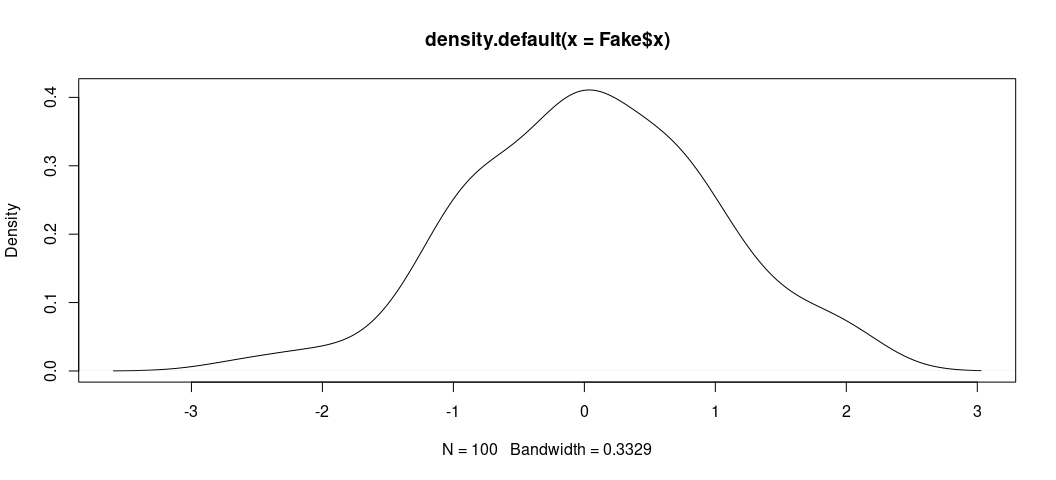
Here, we see the data look nice and “normal” with a clear central tendency and a shape approximating a true bell curve.
Here’s the prettier ggplot way. ggplot stuff (by way of {ggplot2})
comes default in {tidyverse}. Once you load {tidyverse}, you load
all the {ggplot2} functionality you could want.
Fake %>%
  ggplot(.,aes(x)) +
  geom_density()
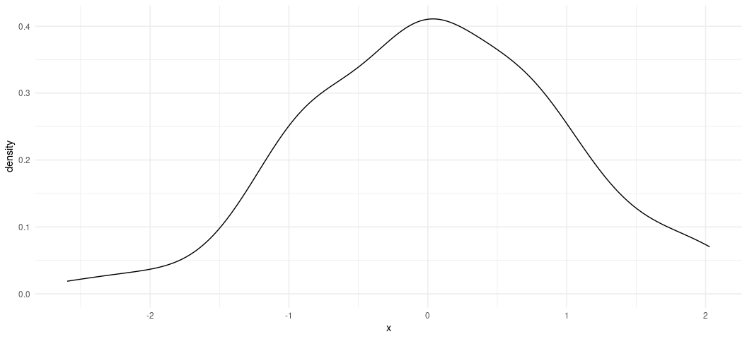
ggplot()’s defaults want to draw attention to the fact that there’s
more a left skew than a right skew. In other words, the maximum of x
is ~2.02 whereas the minimum is about -2.59, but the shape of the data
still look normal. Any irregularities in shape could be attributed to
the fact we only drew 100 observations, which is fairly small set of
observations (all things considered).
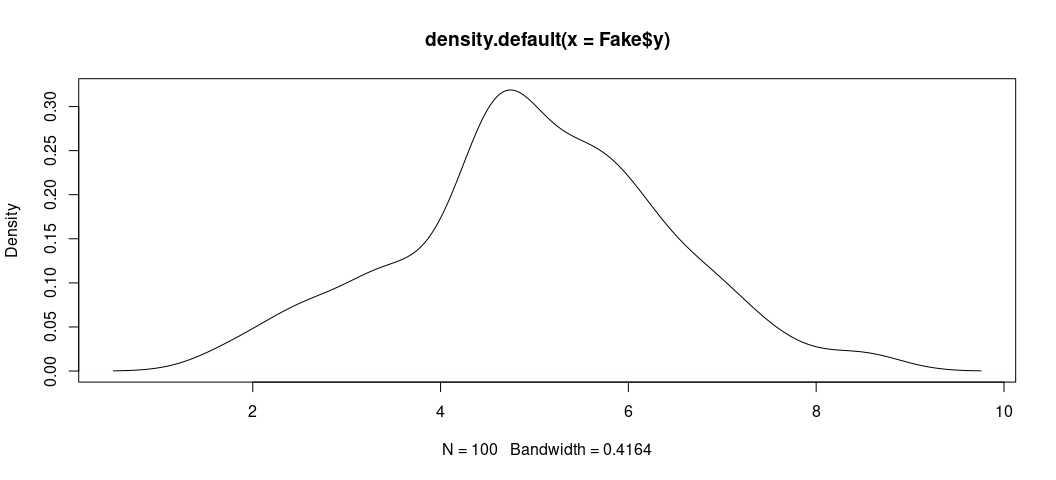
We can do the same thing for the outcome variable y.
plot(density(Fake$y))
Also, in {ggplot2} format…
Fake %>%
  ggplot(.,aes(y)) +
  geom_density()
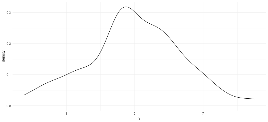
It’s worth reiterating the y is “endogenously” created, and the only endogenous part of our data set. It is an outcome of two exogenous variables (x, which we can measure, and e, which serves as a plug-in for background noise in the underlying population).
Can OLS capture these known attributes about the data? We’ll use the
lm() function in R to find out. lm() is the base R function for
estimating linear models. It’s syntax is simple, especially in a simple
case like this. The two basic things you’ll want to feed it are the
formula, separated by a comma, then the name of the data set for which
you want to regress your dependent variable on your independent
variable(s). Here, we’re doing a super simple regression of y on x.
Then, we’ll get a summary of the model with summary().
M1 <- lm(y ~ x, data=Fake)
summary(M1)
#>
#> Call:
#> lm(formula = y ~ x, data = Fake)
#>
#> Residuals:
#>     Min      1Q  Median      3Q     Max
#> -2.5346 -0.7053  0.1223  0.7281  1.9631
#>
#> Coefficients:
#>             Estimate Std. Error t value Pr(>|t|)
#> (Intercept)  4.94563    0.09956  49.677   <2e-16 ***
#> x            1.06807    0.10752   9.934   <2e-16 ***
#> ---
#> Signif. codes:  0 '***' 0.001 '**' 0.01 '*' 0.05 '.' 0.1 ' ' 1
#>
#> Residual standard error: 0.994 on 98 degrees of freedom
#> Multiple R-squared:  0.5017, Adjusted R-squared:  0.4967
#> F-statistic: 98.69 on 1 and 98 DF,  p-value: < 2.2e-16
Our question was whether OLS can capture the known population parameters
that we created. The answer is yes. Yes, it can. In a simple bivariate
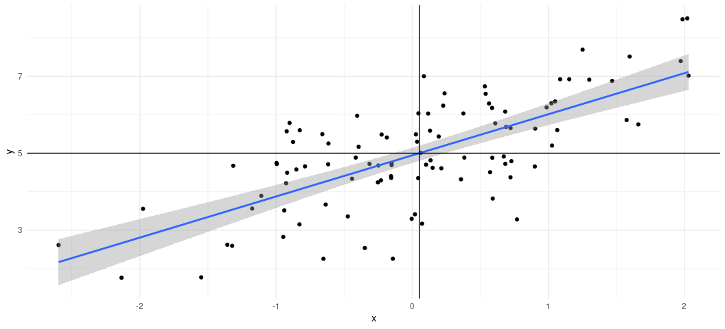
case, you can see what this would look like visually with a scatterplot.
I want you to see what this is doing. First, we’re going to use our data
and, with the pipe operator (%>%), we’re going to pass the data to a
ggplot() function with a simple aesthetic (aes()) argument creating
an x-axis for x and y axis for y. Then, using + (which is the
{ggplot2} continuation operator), we’re going to create a scatterplot
with geom_point(). Then, using another continuation operator (+),
we’re going to use geom_smooth() to create a line of best fit for the
data. Importantly, you have to specify you want a linear smoother
(method = "lm") to communicate what a simple bivariate case is doing.
The default is method = "loess", which has its own nice features but
it’s not what we want here. Finally, we’re going to create two lines
over the plot. The first uses geom_vline(xintercept = mean(Fake$x)) to
add a vertical line through the mean of x. The second uses
geom_vline(yintercept = mean(Fake$y)) to create a horizontal line
through the mean of y. Notice that the line of best fit runs through
the intersection of both them.
Fake %>%
  ggplot(.,aes(x, y)) +
  geom_point() +
  geom_smooth(method = "lm") +
  geom_vline(xintercept = mean(Fake$x)) +
  geom_hline(yintercept = mean(Fake$y))
#> `geom_smooth()` using formula = 'y ~ x'
How to Evaluate Your Linear Model Output
This graph is great for visualizing a super simple bivariate case, but things are never so simple. So, let’s walk through a little bit of the important output from the model on its own terms. Let’s start with the “coefficients”, since they are the main reason you’re doing this. We mainly wanted to know if we could capture the “true” effect of x on y. The “true” effect is 1. The OLS estimator says it’s about 1.06. That’s technically wrong, sure, but the coefficient is what it is because it’s also capturing the correlation between x and the error term e, which we don’t get to include in the model. So, OLS says it’s 1.06, which comes with a standard error of about .10. A standard error below the estimate is about .961. A standard error above the estimate is about 1.175.
Put another way, given estimation and fundamental uncertainty about the model, our estimated effect of x on y is within a standard error of what we know it actually is. We captured the true population parameter of interest to us.
The other thing you want to know from your regression model is whether the effect of your independent variable of interest on the dependent variable is “statistically significant.” This term is very misleading, to be frank. About 10 years ago, it appeared on this list of scientific ideas that scientists wish you’d stop misusing. Briefly:
“Statistically significant” is one of those phrases scientists would love to have a chance to take back and rename. “Significant” suggests importance; but the test of statistical significance, developed by the British statistician R.A. Fisher, doesn’t measure the importance or size of an effect; only whether we are able to distinguish it, using our keenest statistical tools, from zero. “Statistically noticeable” or “Statistically discernible” would be much better.
Notice what this means for what you’re doing. You’re not testing, necessarily, whether you’ve identified the “true” effect when you evaluate statistical significance. You’re testing whether you could rule out something else: 0. That’s at least what gets returned to you here, and the t-statistic that gets reported is conveniently just the coefficient over the standard error. When the absolute value of that t-statistic is large, and its associated p-value falls below some threshold of interest to you, you can reject the null hypothesis and assert that what you observed is highly improbable if the true effect is 0 with precision. That’s indeed the case here. The true effect is 1. We observed 1.06. The t-statistic associated with that coefficient and standard error is about 9.9. That’s comically large, given the distribution of Student’s t for 98 degrees of freedom. The probability of observing what we got is basically 0 if the true effect were 0 (and it’s not, because it’s 1). So, you can reject the null hypothesis and assert that what you got is closer to what it truly is, assuming repeated sampling and fixed population parameters. The first part of that may not apply here, but the second one does. We created the data.
What About the Intercept?
You don’t evaluate “statistical significance” in the same way for the y-intercept. There is no “null hypothesis” to note in the context of the intercept. It’s just an estimate of y when x is 0. Here, we are adequately capturing it’s true value (i.e. it’s actually 5, but we got 4.94). Dividing that estimated intercept over its standard error returns a ridiculously large t-statistic that means you can comfortably rule out 0. Then again, you weren’t testing that it’s 0. It’s just some constant baseline for y.
Here’s another way of illustrating this. Let’s create another variable, y2. It has this formula.
# I could alternatively write this as just `y2 = x + e`.
Fake %>%
  mutate(y2 = 0 + x  + e) -> Fake

Fake
#> # A tibble: 100 × 4
#>          x       e     y      y2
#>      <dbl>   <dbl> <dbl>   <dbl>
#>  1 -0.997   0.745   4.75 -0.252
#>  2  0.722  -1.35    4.38 -0.625
#>  3 -0.617   0.330   4.71 -0.287
#>  4  2.03   -0.0127  7.02  2.02
#>  5  1.07   -0.464   5.60  0.602
#>  6  0.987   0.205   6.19  1.19
#>  7  0.0275  0.464   5.49  0.491
#>  8  0.673  -0.757   4.92 -0.0838
#>  9  0.572  -1.07    4.51 -0.493
#> 10  0.904  -0.263   5.64  0.641
#> # ℹ 90 more rows
Let’s run another regression.
M2 <- lm(y2 ~ x, Fake)
summary(M2)
#>
#> Call:
#> lm(formula = y2 ~ x, data = Fake)
#>
#> Residuals:
#>     Min      1Q  Median      3Q     Max
#> -2.5346 -0.7053  0.1223  0.7281  1.9631
#>
#> Coefficients:
#>             Estimate Std. Error t value Pr(>|t|)
#> (Intercept) -0.05437    0.09956  -0.546    0.586
#> x            1.06807    0.10752   9.934   <2e-16 ***
#> ---
#> Signif. codes:  0 '***' 0.001 '**' 0.01 '*' 0.05 '.' 0.1 ' ' 1
#>
#> Residual standard error: 0.994 on 98 degrees of freedom
#> Multiple R-squared:  0.5017, Adjusted R-squared:  0.4967
#> F-statistic: 98.69 on 1 and 98 DF,  p-value: < 2.2e-16
Notice x is unaffected, but now the y-intercept is “statistically insignificant?” Except that it’s not, because that’s not how you should evaluate the y-intercept. The statistics you get back just tell you the estimated value of y when x is 0 could be 0 (because that’s what it is).
This is often why you’ll read regression tables that just outright omit the y-intercept and take no effort to model them. I’ll only retort that you may encounter or want to learn more complicated models, so called “mixed (effects) models”, that include random intercepts for different grouping clusters in a data set. For those models to converge, they’ll often need a so-called “global” intercept in order to know against what baseline a group may vary. This is why I encourage students to get comfortable with scaling inputs into the model in order to create more meaningful y-intercepts that, with real world data, might tell the reader (and yourself) something about the typical value of y.
Indeed, that’s what the intercept is communicating here, plus-or-minus error.
Fake %>%
  summarize(mean_y = mean(y),
            mean_y2 = mean(y2)) %>% data.frame
#>     mean_y     mean_y2
#> 1 5.001493 0.001493478
Other Things You Should Know About Your OLS Model
I’ll go into the other things you should know about the OLS model, based loosely on the order of importance of them.
Fitted Values and Residuals
The OLS model draws a line of best fit through the data and that line of best fit is the one that minimizes the sum of squared prediction errors. This means there are estimates for a particular data point, given this line of “best fit”, and invariably an “error” (which is the distance between the estimated value of y, and what the “true” value of y is).
In R speak, these are the fitted values and the residuals. The fitted values are the estimated values of y for each data point (given the regressors). You may also call these the y-hats. The residuals are the distances between what was fitted and what the observation really is. These are the estimates of e from the data-generating process.
You can extract them both pretty easily in R. Observe, for M1.
Fake %>%
  mutate(fitted = fitted(M1),
         resid = resid(M1)) -> Fake

Fake
#> # A tibble: 100 × 6
#>          x       e     y      y2 fitted   resid
#>      <dbl>   <dbl> <dbl>   <dbl>  <dbl>   <dbl>
#>  1 -0.997   0.745   4.75 -0.252    3.88  0.867
#>  2  0.722  -1.35    4.38 -0.625    5.72 -1.34
#>  3 -0.617   0.330   4.71 -0.287    4.29  0.427
#>  4  2.03   -0.0127  7.02  2.02     7.11 -0.0965
#>  5  1.07   -0.464   5.60  0.602    6.08 -0.482
#>  6  0.987   0.205   6.19  1.19     6.00  0.192
#>  7  0.0275  0.464   5.49  0.491    4.97  0.516
#>  8  0.673  -0.757   4.92 -0.0838   5.66 -0.748
#>  9  0.572  -1.07    4.51 -0.493    5.56 -1.05
#> 10  0.904  -0.263   5.64  0.641    5.91 -0.270
#> # ℹ 90 more rows
Here’s a way to wrap your head around what this is telling you. For that
first row, the value of x is about -.997. The value of y is 4.75.
Given the line that minimizes the sum of squared prediction errors, the
coefficient for a one-unit change of x on y is about 1.06. The
y-intercept we estimate to be about 4.94.
4.94 + 1.06*(-.997) = about 3.88. That’s the fitted value of y. In
actuality, it’s about 4.75. 4.75 - 3.88 (alternatively: y - y-hat for
that observation) is about .867. That’s the error, or the residual you
see there. Do note there’s rounding error here for presentation, but
hopefully the principle is clear.
Of note, I don’t really know why R’s default summary() option includes
that kind of summary of the residuals first, but that’s the top thing
you see. Observe:
tibble(x = resid(M1)) %>%
  summarize(min = min(x),
            q1 = quantile(x, .25),
            median = median(x),
            q3 = quantile(x, .75),
            max = max(x)) %>% data.frame
#>       min         q1    median        q3      max
#> 1 -2.5346 -0.7053101 0.1223389 0.7280966 1.963144

summary(M1)
#>
#> Call:
#> lm(formula = y ~ x, data = Fake)
#>
#> Residuals:
#>     Min      1Q  Median      3Q     Max
#> -2.5346 -0.7053  0.1223  0.7281  1.9631
#>
#> Coefficients:
#>             Estimate Std. Error t value Pr(>|t|)
#> (Intercept)  4.94563    0.09956  49.677   <2e-16 ***
#> x            1.06807    0.10752   9.934   <2e-16 ***
#> ---
#> Signif. codes:  0 '***' 0.001 '**' 0.01 '*' 0.05 '.' 0.1 ' ' 1
#>
#> Residual standard error: 0.994 on 98 degrees of freedom
#> Multiple R-squared:  0.5017, Adjusted R-squared:  0.4967
#> F-statistic: 98.69 on 1 and 98 DF,  p-value: < 2.2e-16
Keep your fitted values and residuals handy, as they’ll be very useful
(really: necessary) information for model diagnostics. Another good way
of extracting them with the augment() function in the {broom}
package that is installed when you install {tidyverse}.
broom::augment(M1)
#> # A tibble: 100 × 8
#>        y       x .fitted  .resid   .hat .sigma  .cooksd .std.resid
#>    <dbl>   <dbl>   <dbl>   <dbl>  <dbl>  <dbl>    <dbl>      <dbl>
#>  1  4.75 -0.997     3.88  0.867  0.0229  0.995 0.00911      0.882
#>  2  4.38  0.722     5.72 -1.34   0.0152  0.990 0.0143      -1.36
#>  3  4.71 -0.617     4.29  0.427  0.0152  0.998 0.00145      0.432
#>  4  7.02  2.03      7.11 -0.0965 0.0557  0.999 0.000295    -0.0999
#>  5  5.60  1.07      6.08 -0.482  0.0220  0.998 0.00270     -0.490
#>  6  6.19  0.987     6.00  0.192  0.0202  0.999 0.000394     0.195
#>  7  5.49  0.0275    4.97  0.516  0.0100  0.998 0.00138      0.522
#>  8  4.92  0.673     5.66 -0.748  0.0145  0.996 0.00423     -0.758
#>  9  4.51  0.572     5.56 -1.05   0.0132  0.993 0.00754     -1.06
#> 10  5.64  0.904     5.91 -0.270  0.0185  0.999 0.000708    -0.274
#> # ℹ 90 more rows
You obviously get other output with this function, which will come in handy when we delve into model diagnostics in earnest.
R-Squared
OLS textbooks sometimes encourage new students to read too much into R-squared. Minimally, it tells you how well the model fits the data. It’s bound between 0 and 1, and higher values = better fit. However, ask yourself what primarily is the purpose of the regression model. Is it to identify a causal effect? If so, those minimal OLS models regressing some outcome y on a treatment will typically have very low R-squareds even if the causal effect is identified. Is the goal to fit the data? Then higher R-squared is obviously very nice but saturating the model with regressors for the sake of juicing an R-squared may come with biasing coefficients (making it more difficult to identify signals from the din).
I do want to draw your attention to a few things. For one, in the simple bivariate case, R-squared is quite literally Pearson’s r, squared. Observe.
Fake %>% summarize(cor = cor(x, y),
                   cor2 = cor^2) -> correlations

correlations
#> # A tibble: 1 × 2
#>     cor  cor2
#>   <dbl> <dbl>
#> 1 0.708 0.502
correlations %>% pull(2)
#> [1] 0.5017422
summary(M1)$r.squared
#> [1] 0.5017422
Second, you’ll see something called an adjusted R-squared. Simply, think of this as a kind of penalty that downweights (sic?) the normal (“multiple”) R-squared for the presence of additional parameters. It’s why it’ll always want to be smaller than the other R-squared metric you see. Here’s the hard way of calculating what comes default in R.
(1 - ((1-summary(M1)$r.squared)*(nobs(M1)-1)/(nobs(M1)-length(M1$coefficients))))
#> [1] 0.496658
In plain English: adjusted R-squared = 1 - (1 - R^2)*(n - 1)/n - k. In
this case, the difference is small, but the adjusted R-squared is
telling you have more than one parameter here (i.e. the intercept).
Long story short: a high R-squared is nice, but it’s not necessary for identifying a causal effect of x on y. There’s no agreement on what a “good R-squared” looks like.
Residual Standard Error
The residual standard error is the standard error of the residuals. It’s not too hard to calculate in a simple case like this. Take the sum of squared residuals and square those. Divide it over the degrees of freedom in the model. There’s your residual standard error. You’ll see the sum of squared residuals often referred to as the deviance of the model.
sqrt(deviance(M1)/df.residual(M1))
#> [1] 0.9939681
sqrt(sum(resid(M1)^2)/98)
#> [1] 0.9939681
There’s more you can do with that deviance. For example, does this look familiar?
1 - (sum(resid(M1)^2)/(sum((Fake$y - mean(Fake$y))^2)))
#> [1] 0.5017422
It’s R-squared, right? You can also calculate R-squared as the deviance
over the total sum of squares. You might see that formula as
1 - RSS/TSS where the deviance is also known as the residual sum of
squares. You can also calculate R^2, more generally, as the sum of
fitted squares (so-called “Explained Squares”) over the total sum of
squares.
(sum((M1$fitted.values - mean(Fake$y))^2))/(sum((Fake$y - mean(Fake$y))^2))
#> [1] 0.5017422
F-statistic
Simply, you’ll never use this. The F-statistic tests against a null hypothesis that the model you estimate performs just as well as the model that guesses just the mean of y. The moment you know anything about your data-generating process is the moment you can start to safely ignore this statistic. In our case, the F-statistic of 98.69 against 98 degrees of freedom comes with a p-value that is basically 0. This model is better than an intercept-only model.
Want to fail this statistic? Do this.
Fake %>%
  mutate(noise = rnorm(100)) -> Fake

M3 <- lm(y ~ noise, data=Fake)
summary(M3)
#>
#> Call:
#> lm(formula = y ~ noise, data = Fake)
#>
#> Residuals:
#>     Min      1Q  Median      3Q     Max
#> -3.2105 -0.6361 -0.1454  0.8449  3.5082
#>
#> Coefficients:
#>             Estimate Std. Error t value Pr(>|t|)
#> (Intercept)  5.00114    0.14062  35.565   <2e-16 ***
#> noise       -0.07235    0.13833  -0.523    0.602
#> ---
#> Signif. codes:  0 '***' 0.001 '**' 0.01 '*' 0.05 '.' 0.1 ' ' 1
#>
#> Residual standard error: 1.406 on 98 degrees of freedom
#> Multiple R-squared:  0.002783,   Adjusted R-squared:  -0.007392
#> F-statistic: 0.2735 on 1 and 98 DF,  p-value: 0.6022
See that p-value with that F statistic? I can’t say that this model performs any better than an intercept only model. Well, duh.
Conclusion
For now, take stock of the following things:
- formula:
lm()is the function you want. You regress whatever your DV is on (~) whatever your independent variable (or variables) is called. If you have multiple IVs, it’ll be something likey ~ x1 + x2. Tell the formula your data come from whatever your data object is called. - coefficient: the coefficient is the rise over run from the slope intercept equation, in as many words. A one-unit change in x coincides with an estimated change of [INSERT COEFFICIENT VALUE HERE] in y.
- statistical significance: you’re assessing the probability of what you observe (with the standard error) if the true effect is zero. Assess statistical significance by whatever evidentiary threshold you choose, but the convention is .05. Don’t bother interpreting “significance” for the intercept.
- other model parameters: R-square is nice when it’s high but it’s not necessary for identifying causal effects. Grabbing the fitted values and residuals from the model will be useful for important diagnostics.